


See all 3 parts of the custom component series:
Both the tooltip and Fiori dialog are available for use now. |
Someone asked in a community forum if there was a help feature where you could expose a little icon that would give help for a component or for your app. As far as I know, there isn't.
But I decided to make one myself.
I deployed it to the marketplace in EU10 – you should have access if your tenant is in EU10 (if you have a different landscape, I have provided the component in an exported project). So if you want to see it, click on Marketplace.
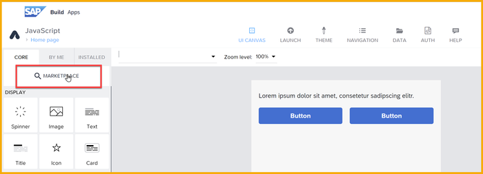
Search for component:
QJihBbRdBz8qLAOhexlMWg
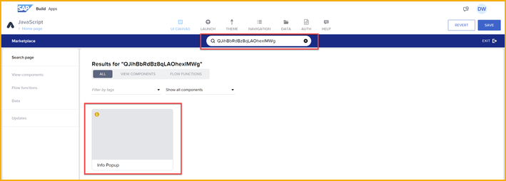
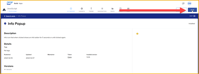
Click Install.
The component will be added to the top of the Install tab of components.
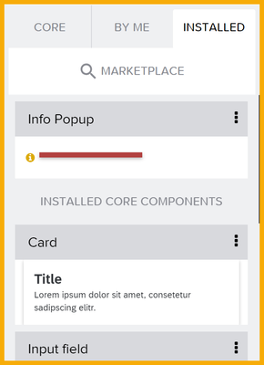
Now you can put it wherever you want a tooltip.
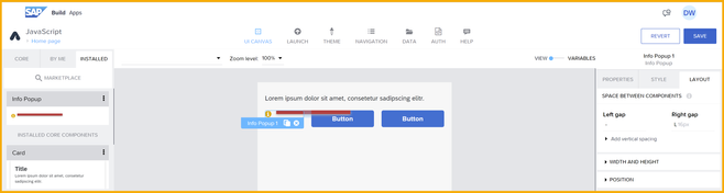
What's nice about the tooltip:
- The tooltip will show above all other components.
- The tooltip and icon will not take up much space.
- The tooltip will disappear if you click the icon again or after 5 seconds.
But you do have to configure a few things, but it will take less than a minute.
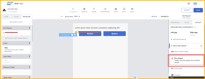
You must set the width of the component to Fit content.
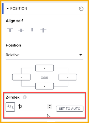
You must set the Z-index to something above the other components, like 10.
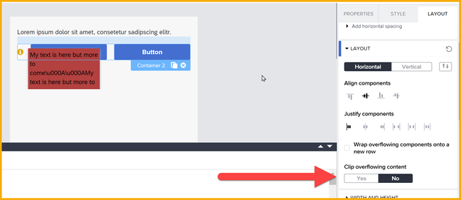
If you put the component inside a container, you must set Clip overflowing content of that container to No.
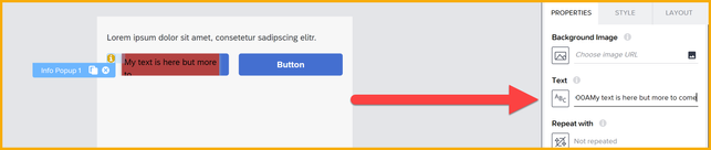
And finally, you must set the text you want to display. You can add unicode characters to add line breaks, like this text (you may have to use a formula so the slashes don't get escaped):
This is the text to explain what this button does.
\u000A\u000A
This is the second line.
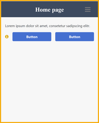
Now if you run the app. It appears like this:
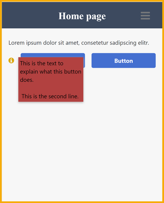
And if you click the icon it shows this:
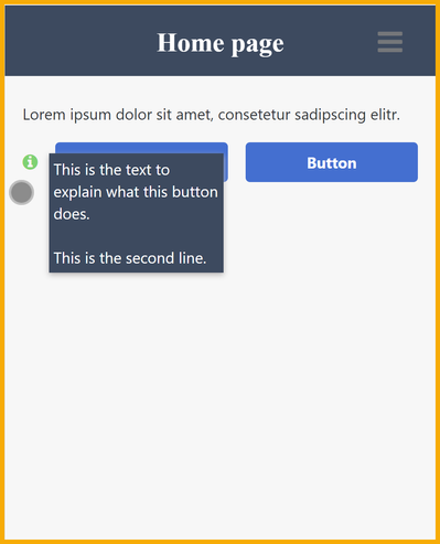
You can change the colors by opening the style editor (double-click the component on the canvas).
Next time I'll show you how I built and published the component (or feel free to reverse engineer my component).
 Bluesky