- SAP Community
- Products and Technology
- Enterprise Resource Planning
- ERP Blogs by SAP
- HR Renewal 1.0 Feature Pack 4: Why did SAP introdu...
- Subscribe to RSS Feed
- Mark as New
- Mark as Read
- Bookmark
- Subscribe
- Printer Friendly Page
- Report Inappropriate Content
- SAP Managed Tags:
- HCM (Human Capital Management)
Over the past few weeks, I’ve read the very interesting blogs of Raja Sekhar Kuncham and Carrie Lande about the new Workforce Viewer functionality included in HR renewal 1.0 Feature pack 4.
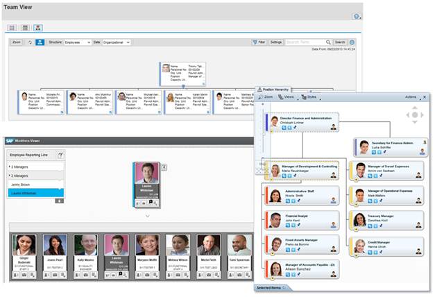
Both blogs describe this as being very useful HTML5-based functionality integrated with many applications like Search, ESS, MSS and HR Administrative services. It helps the user to get an insight into where the object (OrgUnit/Position) or the person is located within the organizational structure of the company.
SAP’s decision to implement our own workforce viewer has received very good feedback from customers who have implemented or validated HR renewal 1.0 FP4.
But this new functionality has also raised questions and left some customers puzzled. They asked us which functionality they should implement and if the workforce viewer replaces the embedded Adobe Flash component and/or the OrgChart Solution Extension, SAP Org Visualization by Nakisa.

With this blog, I will try to clarify the intention SAP had with introducing the Workforce Viewer with HR renewal 1.0 FP4.
First and very important information:
The Workforce Viewer is NOT intended to replace the Flash OrgChart or the list view SAP has implemented in HR renewal. And due to the functional scope of Workforce Viewer it is not meant to be a stand-alone Org Chart solution.
Our customers intensively use our employee and manager self-services and with the first wave of HR renewal 1.0, we introduced more easy-to-use functionality for the professionals. But, nearly all of the professionals are employees too, some also managers. So we have lots of overlaps between these roles.
Working with customers as part of our customer engagement initiative, we got the feedback that customers are looking for a harmonization of the look and feel of the UI’s for all these roles. A user should not necessarily recognize when he switches from an ESS service to a service of a professional. It should appear to be seamless to the user.
We really liked this idea and thought it is long overdue that we simplify and harmonize our UI’s. But the challenge was that there is much more the need for employees and managers using ESS and MSS to work with mobile devices like tablets and smart phones than it is for the professionals. And therefore Flash –which was embedded to visualize the organizational and reporting structure - faced some issues, especially with the rendering on mobile devices that don’t support Flash.
With our ESS/MSS delivery in FP4 and our Fiori concept we decided to bring more HTML5 based functionality to our customers. So it only made sense to take the decision to include a HTML5 based organizational visualization component which can be used in the area of ESS and MSS as well as for professional users.
With FP4 we introduced the landing page for ESS and MSS users and achieved our aim to harmonize the UI for the three roles we had in mind. And the Workforce Viewer is integrated into the lanes, accessible via Team view (MSS), My Info & Search (ESS), Organizational Favorites and Search (professionals).
Writing that, I think it makes it clear why SAP decided to introduce the HTML5-based Workforce Viewer that complements SAP’s idea to bring a renovated, “fancy”, easy-to- use UI to the customers.
But, I also understand the questions customer now have -- which solution is the best for their needs, and what is the difference between all of them.
In my next blog my colleague Vijaya and I will focus on a comparison of the three options SAP delivers with their HCM solution.
So - stay tuned for more details on SAP’s options to visualize the workforce of a company…
You must be a registered user to add a comment. If you've already registered, sign in. Otherwise, register and sign in.
-
API and Integration
1 -
Artificial Intelligence (AI)
1 -
Business Trends
361 -
Business Trends
77 -
Customer COE Basics and Fundamentals
1 -
Digital Transformation with Cloud ERP (DT)
1 -
Event Information
454 -
Event Information
63 -
Expert Insights
109 -
Expert Insights
444 -
General
2 -
Governance and Organization
1 -
Great Britain
1 -
Introduction
1 -
Life at SAP
408 -
Life at SAP
7 -
Product Updates
4,610 -
Product Updates
568 -
Roadmap and Strategy
1 -
Technology Updates
1,490 -
Technology Updates
224
- PDM Newsletter RISE with SAP - November 2024 in Enterprise Resource Planning Blogs by SAP
- SAP S/4HANA Cloud Private Edition | 2023 FPS02 Release – Part 2 in Enterprise Resource Planning Blogs by SAP
- From A to Z: Setup a Starter System of the SAP S/4HANA Cloud Public Edition [2024 Edition] in Enterprise Resource Planning Blogs by SAP
- SAP S/4HANA Cloud Private Edition | 2023 FPS02 Release – Part 1 in Enterprise Resource Planning Blogs by SAP
- SAP Enterprise Support Academy Newsletter October 2024 in Enterprise Resource Planning Blogs by SAP
| User | Count |
|---|---|
| 12 | |
| 5 | |
| 3 | |
| 3 | |
| 3 | |
| 3 | |
| 3 | |
| 3 | |
| 3 | |
| 2 |