- SAP Community
- Groups
- Interest Groups
- SAP Builders
- Discussions
- Re: SAP Build Challenge – Week 2 – UI Design
- Subscribe to RSS Feed
- Mark Topic as New
- Mark Topic as Read
- Float this Topic for Current User
- Bookmark
- Subscribe
- Mute
- Printer Friendly Page
SAP Build Challenge – Week 2 – UI Design
- Mark as New
- Bookmark
- Subscribe
- Mute
- Subscribe to RSS Feed
- Permalink
- Report Inappropriate Content
2023 Apr 08 6:45 PM - edited 2023 Apr 18 2:41 PM
This post is part of the SAP Build Community Challenge (April 2023)
This week’s challenge involves another area that is key to build apps with SAP Build Apps, but is often overlooked when learning about the tool: UI Design.
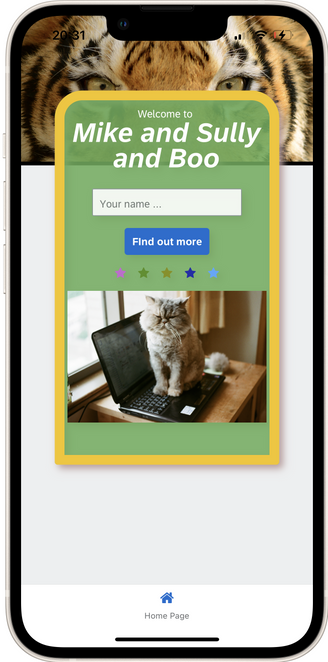
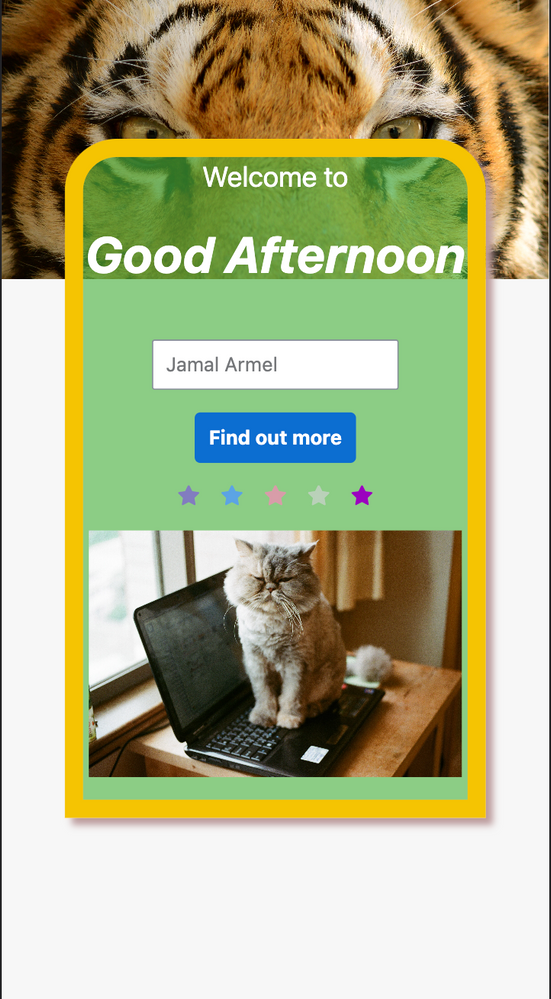
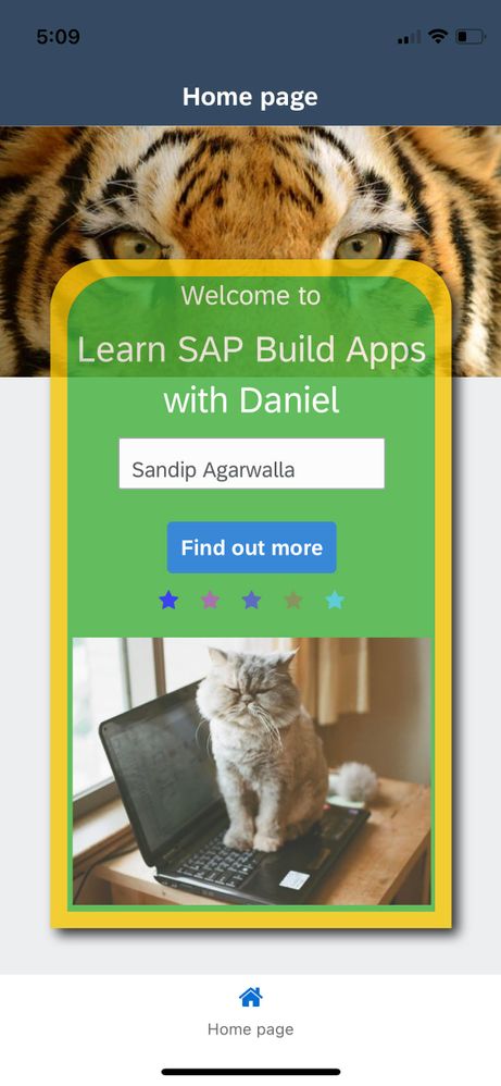
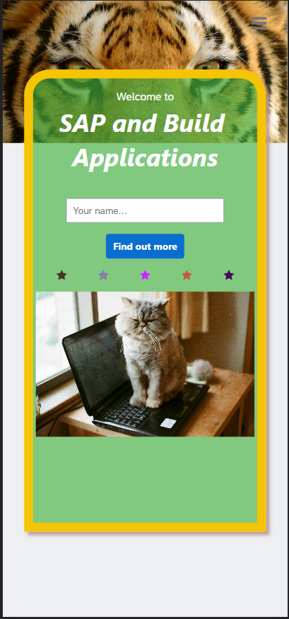
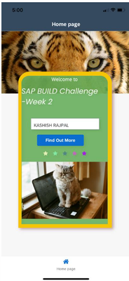
Here is a UI – admittedly not the most sophisticated (and still includes that grumpy cat), but it illustrates some of the techniques that you can use to make a professional UI.
Notice the following:
- The Bengal tiger image (at top) goes right to the edge of the app.
- The inner container is translucent (i.e., opacity < 100%, so that you can see the tiger underneath).
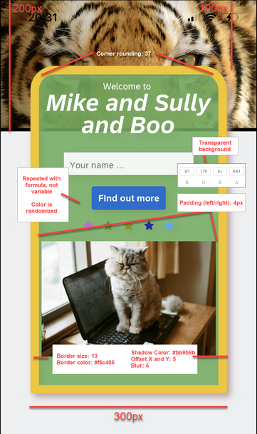
- The inner container has a shadow with X and Y offsets of 5, a blur radius of 5, and a color of #BB9B9B.
- The inner container has custom padding on the left and right, so that the cat picture fits nicely into with breathing room of 4 pixels either side.
- The top of the inner container has rounded corners, while the bottom has straight corners.
- The background of the app is light gray (Level 4 Background in the Universal pallette).
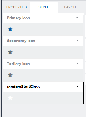
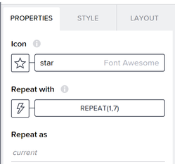
- There are multiple stars, and the colors are randomized.
- The navigation bar at the bottom of the page says "Home Page" (not "Empty Page").
Here are some learning materials:
- Full screen background
- Star Wars App – No-Code Challenge (example of an app with background image)
- Z-index (documentation about positioning things on top of each other)
- Example (see how Onno Bos overlays things in his app – just a few minutes)
And here are some specs about the app:
For the images, I used these:
Bengal tiger (3000 x 1500 pixels):
Grumpy cat (3089 x 2048 pixels):
Challenge
- Re-create the above app – EXCEPT: change the "Mike and Sully and Boo" text to something unique for your app, and remember that colors of the stars are randomized.
- Launch the app (either on preview app or on web).
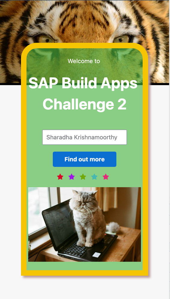
- Enter your name in the input box, and take a screenshot.
- Post the screenshot to this discussion thread, along with at least one sentence – about how you knew what to do, and either a new feature you'd like to see or an existing feature you'd like to learn more about.
- BONUS: Add to your entry the name of the movie alluded to by something in the UI shown above.
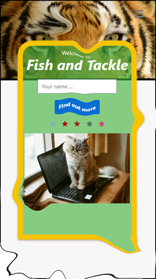
Even if you can’t get it exactly like the one we gave, and it ends up being more like a Dali painting, post it anyway. We’d like to see what you were able to do.
Quick Start
Here's a 1-minute video of what you need to do.
- Mark as New
- Bookmark
- Subscribe
- Mute
- Subscribe to RSS Feed
- Permalink
- Report Inappropriate Content
2023 Apr 17 5:24 AM
The border itself is 13px? The intricacies of the slight variances between devices in how they display such specific features is not my forte, though generally I can find workarounds ... but you already found it. I have nothing better right now.
- Mark as New
- Bookmark
- Subscribe
- Mute
- Subscribe to RSS Feed
- Permalink
- Report Inappropriate Content
2023 Apr 17 3:46 PM
- Mark as New
- Bookmark
- Subscribe
- Mute
- Subscribe to RSS Feed
- Permalink
- Report Inappropriate Content
2023 Apr 17 6:46 PM - last edited on 2023 Apr 17 6:47 PM by Former Member
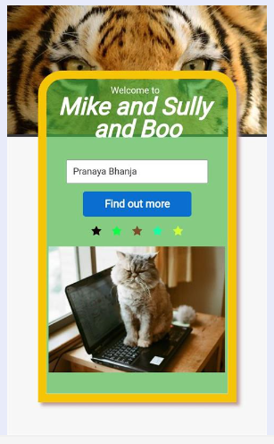
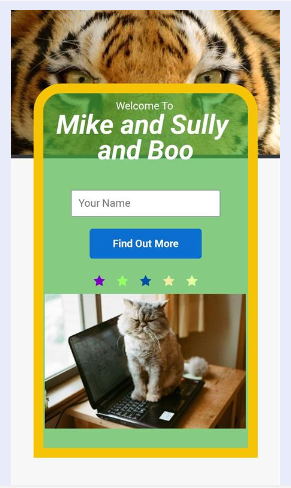
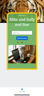
My entry for challenge 2. I am not a UI person but thoroughly enjoyed the challenge. I learned a lot about layering the UI elements and how easy it is do it with SAP Build. Thanks for setting this up.
Movie: Monsters Inc..
- Mark as New
- Bookmark
- Subscribe
- Mute
- Subscribe to RSS Feed
- Permalink
- Report Inappropriate Content
2023 Apr 18 6:45 AM
- Mark as New
- Bookmark
- Subscribe
- Mute
- Subscribe to RSS Feed
- Permalink
- Report Inappropriate Content
2023 Apr 18 12:49 PM
- Mark as New
- Bookmark
- Subscribe
- Mute
- Subscribe to RSS Feed
- Permalink
- Report Inappropriate Content
2023 Apr 18 1:02 PM
- Mark as New
- Bookmark
- Subscribe
- Mute
- Subscribe to RSS Feed
- Permalink
- Report Inappropriate Content
2023 Apr 19 10:47 AM - edited 2023 Apr 25 12:15 PM
- Mark as New
- Bookmark
- Subscribe
- Mute
- Subscribe to RSS Feed
- Permalink
- Report Inappropriate Content
2023 Apr 25 12:40 PM
- Mark as New
- Bookmark
- Subscribe
- Mute
- Subscribe to RSS Feed
- Permalink
- Report Inappropriate Content
2023 Apr 26 4:53 AM
- Mark as New
- Bookmark
- Subscribe
- Mute
- Subscribe to RSS Feed
- Permalink
- Report Inappropriate Content
2023 Apr 21 11:53 AM
- Mark as New
- Bookmark
- Subscribe
- Mute
- Subscribe to RSS Feed
- Permalink
- Report Inappropriate Content
2023 Apr 25 12:23 PM
- Mark as New
- Bookmark
- Subscribe
- Mute
- Subscribe to RSS Feed
- Permalink
- Report Inappropriate Content
2023 Apr 21 12:17 PM
- Mark as New
- Bookmark
- Subscribe
- Mute
- Subscribe to RSS Feed
- Permalink
- Report Inappropriate Content
2023 Apr 22 10:57 PM
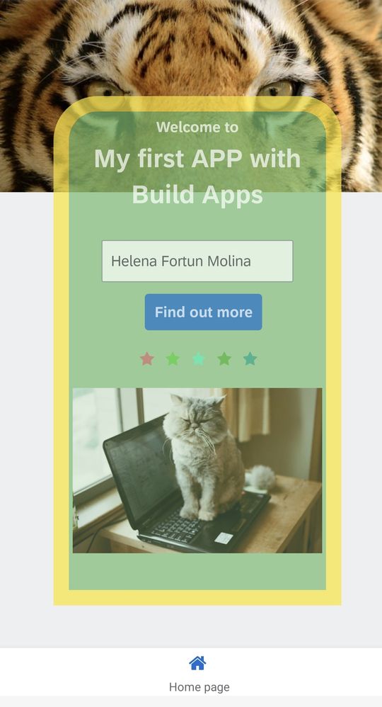
Hello Dan,
it was a great fun - but it took two hours to get the random colour working in the repeat function. Now it's done:
As movie I think it is Monsters.
Best regards!
Helena
- Mark as New
- Bookmark
- Subscribe
- Mute
- Subscribe to RSS Feed
- Permalink
- Report Inappropriate Content
2023 Apr 25 11:58 AM
- Mark as New
- Bookmark
- Subscribe
- Mute
- Subscribe to RSS Feed
- Permalink
- Report Inappropriate Content
2023 Apr 23 11:21 AM
- Mark as New
- Bookmark
- Subscribe
- Mute
- Subscribe to RSS Feed
- Permalink
- Report Inappropriate Content
2023 Apr 25 11:56 AM
Glad you liked it 😺 Please continue on to the rest
https://blogs.sap.com/2023/03/30/you-think-you-know-sap-build-take-our-challenge/
- Mark as New
- Bookmark
- Subscribe
- Mute
- Subscribe to RSS Feed
- Permalink
- Report Inappropriate Content
2023 Apr 23 5:00 PM
Hello Dan,
Here's my 2nd week challenge submission. It was really nice experience in participating this SAP Build challenge. Thank you so much!
- Mark as New
- Bookmark
- Subscribe
- Mute
- Subscribe to RSS Feed
- Permalink
- Report Inappropriate Content
2023 Apr 24 6:26 AM
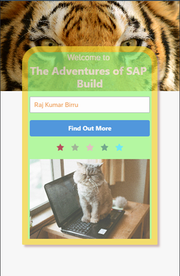
I already know how CSS works in web development so that has helped me in building this easily and I did some development when this platform was called Appgyver. The random colored stars generation was a bit interesting to do, and while building random colored stars I felt it would have been great if we had option to write JS code instead of just depending on existing functions from Formula. I have found the JS option in logic building area at bottom side anyway but if it is available also for UI components properties(wherever Formula is available) would be great.
Here is my application screen:
- Mark as New
- Bookmark
- Subscribe
- Mute
- Subscribe to RSS Feed
- Permalink
- Report Inappropriate Content
2023 Apr 25 12:44 PM
Finally completed 2nd week Challenge. Here is my submission
The random color generation was tricky, used ajitkumarpanda's solution.
manupulating the layout was difficult to begin with, but glad I learned few things along the way.
- Mark as New
- Bookmark
- Subscribe
- Mute
- Subscribe to RSS Feed
- Permalink
- Report Inappropriate Content
2023 Apr 25 1:22 PM
- Mark as New
- Bookmark
- Subscribe
- Mute
- Subscribe to RSS Feed
- Permalink
- Report Inappropriate Content
2023 Apr 25 2:23 PM
I have already submitted 3 & 4.
When week2 came out, I started it but left it mid way as layout thing was making me crazy.
I started again afresh, and glad I could complete it.
- Mark as New
- Bookmark
- Subscribe
- Mute
- Subscribe to RSS Feed
- Permalink
- Report Inappropriate Content
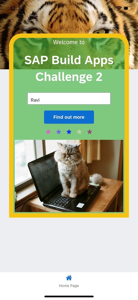
2023 Apr 25 1:10 PM - edited 2023 Apr 25 1:11 PM
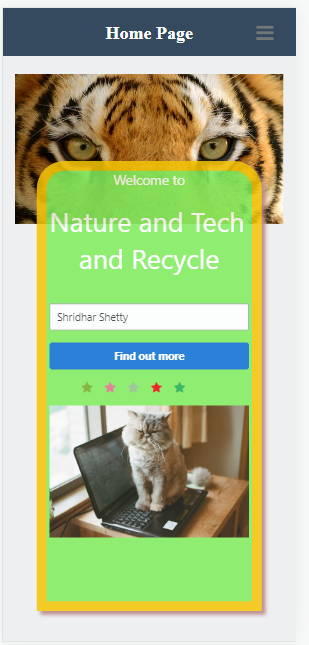
Week 2 challenge: Really curious to know how "Home Page" title is shown at the bottom of the screen.
Thanks
Shridhar
- Mark as New
- Bookmark
- Subscribe
- Mute
- Subscribe to RSS Feed
- Permalink
- Report Inappropriate Content
2023 Apr 25 1:20 PM
- Mark as New
- Bookmark
- Subscribe
- Mute
- Subscribe to RSS Feed
- Permalink
- Report Inappropriate Content
2023 Apr 25 2:09 PM
- Mark as New
- Bookmark
- Subscribe
- Mute
- Subscribe to RSS Feed
- Permalink
- Report Inappropriate Content
2023 Apr 25 3:05 PM
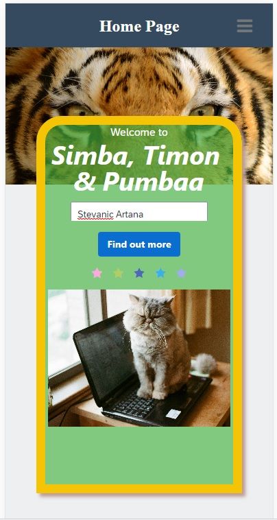
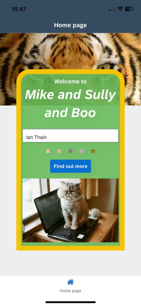
For web, there is a hamburger menu in upper right. The bottom menu will appear on mobile devices. You can of course make any UI you want, including a menu at the bottom. See this menu for ideas: https://www.youtube.com/watch?v=JI7j7ryVMO8
- Mark as New
- Bookmark
- Subscribe
- Mute
- Subscribe to RSS Feed
- Permalink
- Report Inappropriate Content
2023 Apr 25 3:15 PM
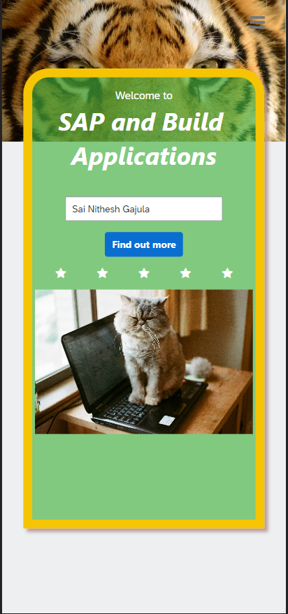
Hi Dan,
Here is my Week 2 submission.
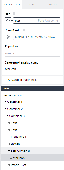
Unfortunately, I couldn't able to get random color for the star. The issue I am suspecting might be because of style class. I couldn't able to overwrite it. few more suggestion may help me.
Below is the formula and screenshots for reference.
MAP(REPEAT(16777215, 5), {"Color":"#"+NUMERIC_BASE(FLOOR(RANDOM()*item), 16)})
Regards,
Sai Nithesh
- Mark as New
- Bookmark
- Subscribe
- Mute
- Subscribe to RSS Feed
- Permalink
- Report Inappropriate Content
2023 Apr 27 8:53 AM
I know many people did as you did, embedding the color in the list used for the repeat.
But I just created a simple list of 5 or 7 elements (the elements could be anything).
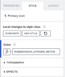
And then for the color in Style I created a randomize formula. I needed to add something dynamic to the formula otherwise all the stars would have the same color.
RGB(RANDOM_INTEGER_BETWEEN(0, 255), RANDOM_INTEGER_BETWEEN(0, 255), RANDOM_INTEGER_BETWEEN(0, 255) + repeatedInfo.current.index)
- Mark as New
- Bookmark
- Subscribe
- Mute
- Subscribe to RSS Feed
- Permalink
- Report Inappropriate Content
2023 Apr 27 12:47 PM
Thanks Dan for the suggestion.
Now I can able to get the start with different colors.
Just curious to know why the earlier code which worked for everyone didn't worked for me.
Regards,
Sai Nithesh Gajula
- Mark as New
- Bookmark
- Subscribe
- Mute
- Subscribe to RSS Feed
- Permalink
- Report Inappropriate Content
2023 Apr 27 1:28 PM
- Mark as New
- Bookmark
- Subscribe
- Mute
- Subscribe to RSS Feed
- Permalink
- Report Inappropriate Content
2023 Apr 25 9:55 PM
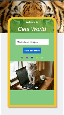
Hi,
Ok, it was hard to set the colors on the stars 😰, but interesting exercise.
Thanks!
Maximiliano.
- Mark as New
- Bookmark
- Subscribe
- Mute
- Subscribe to RSS Feed
- Permalink
- Report Inappropriate Content
2023 Apr 27 8:36 AM
- Mark as New
- Bookmark
- Subscribe
- Mute
- Subscribe to RSS Feed
- Permalink
- Report Inappropriate Content
2023 Apr 26 10:58 AM
Hi Dan,
I'd like to be able to use Fiori UI Elements on the Canvas & integration with Fiori Themes.
The movie is Monsters Inc.
- Mark as New
- Bookmark
- Subscribe
- Mute
- Subscribe to RSS Feed
- Permalink
- Report Inappropriate Content
2023 Apr 27 8:27 AM
- Mark as New
- Bookmark
- Subscribe
- Mute
- Subscribe to RSS Feed
- Permalink
- Report Inappropriate Content
2023 Apr 27 8:14 AM - edited 2023 Apr 27 8:43 AM
- Mark as New
- Bookmark
- Subscribe
- Mute
- Subscribe to RSS Feed
- Permalink
- Report Inappropriate Content
2023 Apr 27 10:48 AM
- Mark as New
- Bookmark
- Subscribe
- Mute
- Subscribe to RSS Feed
- Permalink
- Report Inappropriate Content
2023 Apr 27 10:53 AM
- Mark as New
- Bookmark
- Subscribe
- Mute
- Subscribe to RSS Feed
- Permalink
- Report Inappropriate Content
2023 Apr 27 11:39 AM
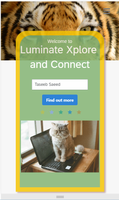
Hi @Dan_Wroblewski ,
Here is my output.
- I encountered some issues while using the AppGyver Mobile Preview to test my mobile app.
- During the AppGyver Challenge 2, I gained knowledge on concepts such as Z Index and Opacity, which helped me to enhance my mobile app.
Thanks
Taseeb Saeed
- Mark as New
- Bookmark
- Subscribe
- Mute
- Subscribe to RSS Feed
- Permalink
- Report Inappropriate Content
2023 Apr 27 1:21 PM
- Mark as New
- Bookmark
- Subscribe
- Mute
- Subscribe to RSS Feed
- Permalink
- Report Inappropriate Content
2023 Apr 27 12:36 PM
Hi Dan,
Here's my submission for week 2 challenge.
It was a great learning to explore on SAP Build and this will definitely help me in showcasing demo for the apps to our clients using LCNC approach.
- Mark as New
- Bookmark
- Subscribe
- Mute
- Subscribe to RSS Feed
- Permalink
- Report Inappropriate Content
2023 Apr 27 1:20 PM
